Usage Guide
Get Started
Thanks for using our theme!
To set up the theme exactly like our demo stores, you may need to install the our free app PapaThemes Widgets. This app provides additional widgets to build the content in Page Builder visually without coding skill.
For displaying your Instagram photos on your website, you can use our free tool PapaThemes Instagram. We will guide you step by step later in this manual.
Customizing Typography, Fonts and Colors
Customizing Typography, Fonts and Colors, Buttons in Page Builder > Theme Styles > General. There are dozens of options to help you customize your website beautifully and uniquely.
Customizing Checkout Page's Typography and Colors
Customizing the checkout page's typography and colors in Page Builder > Theme Styles > Optimized Checkout
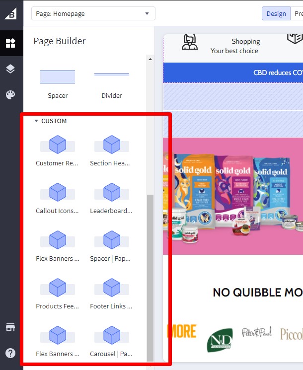
Installing PapaThemes Widgets App
Find and install PapaThemes Widgets app from BigCommerce Apps Marketplace.
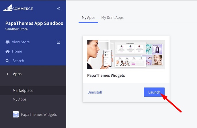
After installed, go to your admin page, on the left sidebar, click Apps > My Apps, click Launch button of PapaThemes Widgets app to open the app:
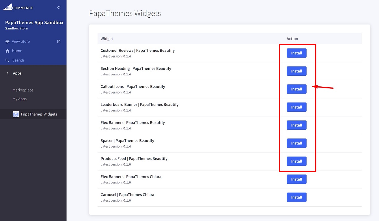
Then click the Install buttons in turn to install all available widgets:
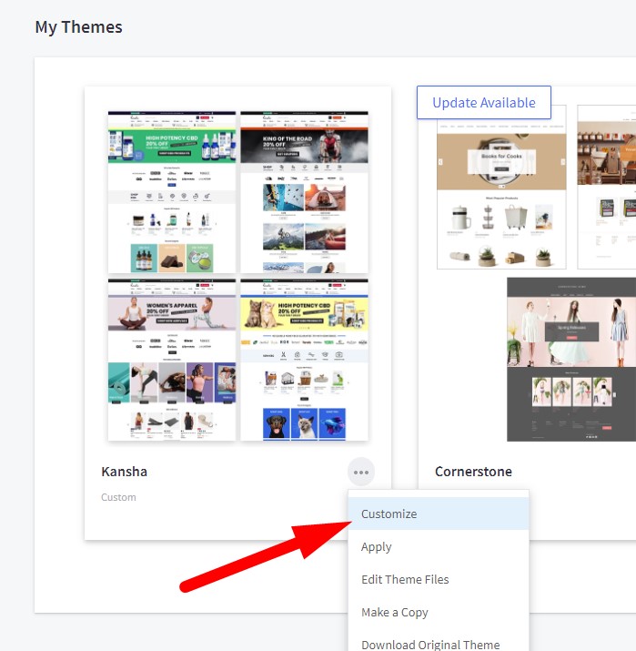
Go to Storefront > My Themes > click Customize in dropdown menu of Mooncat theme to open Page Builder. Select any theme style to start:
Verify the widgets installed successfully if they appear in Page Builder:
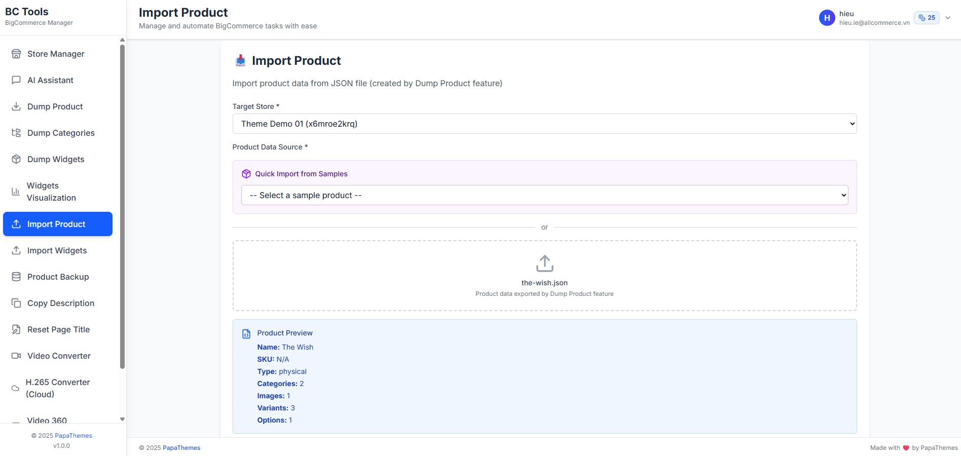
Importing Sample Products
To set up your store to work exactly like our demo stores, you can import sample products using the following steps:
Available Sample Products:
- The Wish Product
- Product link: https://mooncat-bookstore-demo.mybigcommerce.com/the-wish/
- Download: samples/the-wish.json
Import Steps:
- Go to BC Tools
- Click the Store Manager menu item and enter your store API key
- Click the Import Product menu item
- Select your store as the target store
- Select Quick Import from Samples or Under Product JSON File, upload the downloaded JSON file from above
- Click the Import Product button to import the product into your store
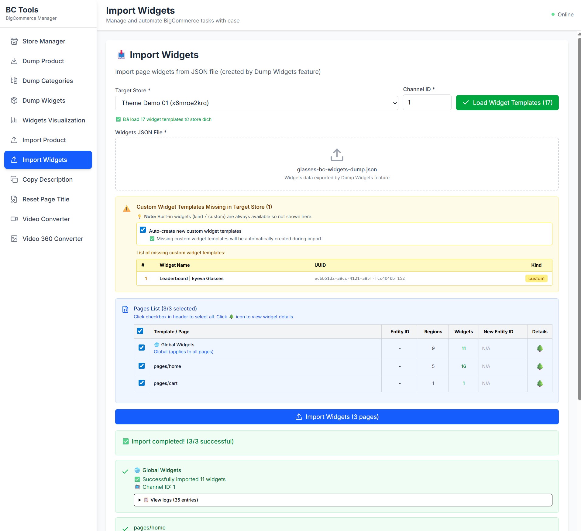
Importing Widgets to Pages
To import widgets to pages (Home, Product, Cart, global regions) in your store to work exactly like our demo stores:
Available Widget Dumps:
-
For Healthcare Demo Store
- Download: samples/healthcare-bc-widgets-dump.json
-
For Bookstore Demo Store
- Download: samples/bookstore-bc-widgets-dump.json
-
For Baby Demo Store
- Download: samples/baby-bc-widgets-dump.json
-
For Petstore Demo Store
- Download: samples/petstore-bc-widgets-dump.json
Import Steps:
- Go to BC Tools
- Click the Store Manager menu item and enter your store API key (skip if already entered)
- Click the Import Widgets menu item
- Select your store as the target store
- Enter your Channel ID (default is
1if you only have one storefront) - Click the Load Widget Templates button to load existing widget templates in your store
- Select Quick Import from Samples or Under Widgets JSON File, upload the downloaded JSON file from above. After selecting the file or sample, a list of widgets and pages to be imported will appear
- Check "Auto-create new custom widget templates" if you want to automatically create widget templates that are not yet available in your store but are required for our theme
- In the Page List, select the pages you want to import widgets into
- Click the Import Widgets button to import the widgets into your store
- Preview your storefront with pages like Home, Product, Cart, which will look like our demo stores
Setting Up Pets Style Home Page
To start customizing the theme, login to your admin panel, go to Storefront > My Themes, click Customize button next to theme thumbnail.
Header

To configure the header, click on Theme Styles > Header section, here you can config the header colors, store logo position and size.
User Navigation allows to change colors of the icon phone, cart.
Top Bar section allows to change color of this top bar.
Watch the instruction video:
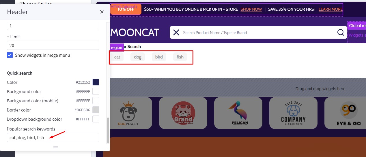
Quick search
Quick Search allows user to change the colors of the search form.
To configure the Quick Search, click on Theme Styles > Header. In Quick Search section you can change text colors, hover, border, and background of the search field.
To change popular search keywords, type your text in popular search keywords field as picture below.
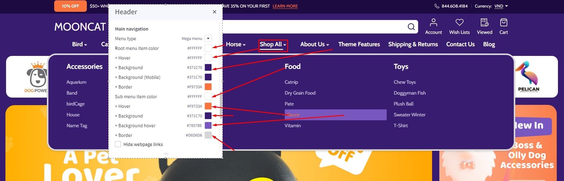
Main Navigation
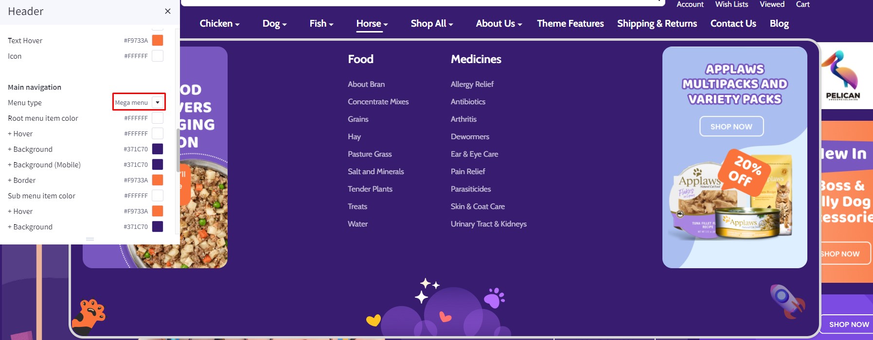
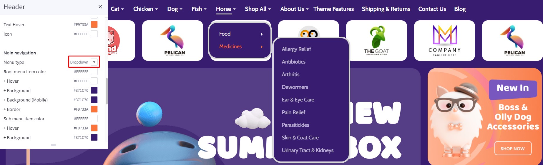
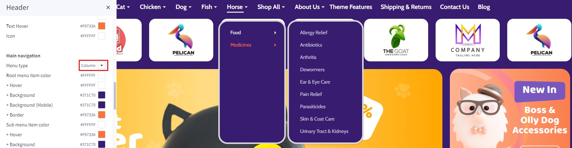
Main Navigation allows to customize this navigation bar like changing the menu type to column, dropdown menu or mega menu; changing colors of the top menu as well as the sub-menus. There is an option "Hide webpage links" that allows to hide the static web page links on the main navigation.
To configure the Main navigation, click on Theme Styles > Header. In Main navigation section you can change:
-
Root menu item color: text color of root menu item.
-
+ Hover: text color on hover on the root menu item.
-
+ Background: background color of sub menu block.
-
+ Background (Mobile): background color of menu on mobile device.
-
Sub menu item color: text color of the submenu item.
-
+ Hover: text color on hover on the submenu item.
-
+ Background: background color of the submenu item.
-
+ Background hover: background color on hover on the submenu item.
-
+ Border: border-color of mega menu popup.
To config style of main navigation, click on Theme Styles > Header. In Main navigation select Menu style. The theme offer 3 option as below:
Mega menu: show submenu under Mega menu style. Mega menu allow user insert banner and product into it
Dropdown: show sub-menu item as dropdown style.
Column: show sub-menu item as column style.
You can also hide or Show web page links and Show widgets in the mega menu.
Watch the instruction video:
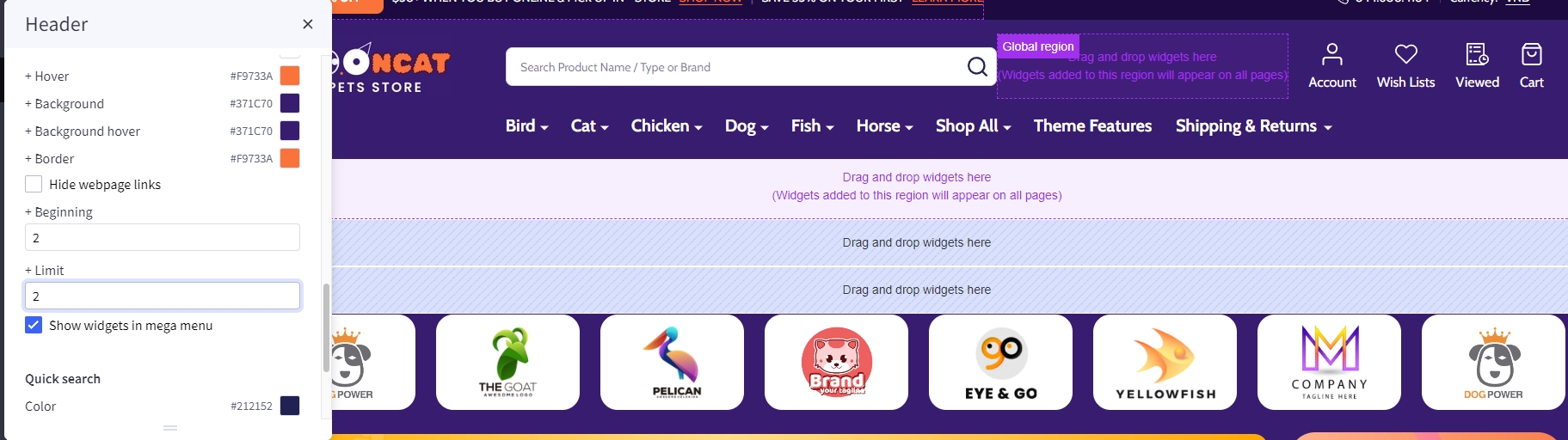
Hide webpage links
To hide Weboage links such as Contact us, About Us, Shipping and return from header, in Themes style > Header Find Hide Webpage links option checked to hide all the links except Categories link.
If you only want to hide some specific links not all the link you can do following step:
+ Beginingfield: input the order link you want to show.+ Limitfield: input number web link you want to show after begining field.
For example: if you only want show Theme Features and shipping & return: - Begining field: 2; - limit field: 2;
Note: the order will only count non-categories link.
Before

Affer:
Products by category in mega menu
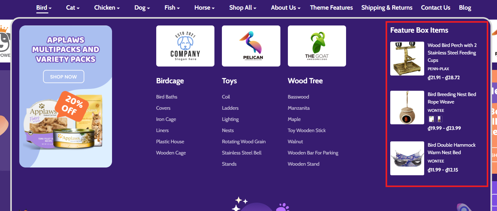
To create Products by category in mega menu:
Drag and drop Layout widget to the corresponding position, change Column = 1. Select Column 1, set Padding = 0 0 0 0.
Drag and drop Section Heading | PapaThemes Beautify widget into Column 1. Typing your text (example "Feature Box Items"), set Padding = 10 0 10 0, Padding (Mobile) = 10 0 10 0.
Drag and drop Products Feed | PapaThemes Beautify widget into Column 1 below Section Heading widget. In Products enter URL of the category to fetch products (example /bird/). Checked Render with template and enter your template file: beautify/products-feed/list.
Change Limit = 3.
Watch the instruction video:
Top Banner
Go back to Storefront > My Themes > click Customize button beside the theme thumbnail. You can see the top banner appears above the header. To change the colors of the top banner, go to Theme Styles > General > Top banners section. Here you can change the text color and the background color.
Watch the instruction video:
Ad Banner displays on all pages
To display the ad banner appearing on all pages on the header, drag and drop the HTML widget to the corresponding position, paste the given code below to the HTML editor, then click Save HTML button.
<p data-marquee>
<span class="button button--primary button--small">10% Off</span>
<span> $50+ WHEN YOU BUY ONLINE & PICK UP IN - STORE </span>
<span style="color: rgba(255,255,255,0.3)"> | </span>
<span>SAVE 35% ON YOUR FIRST </span>
<a href="/store">LEARN MORE</a>
</p>
The code allows to animate the text sliding from left to right on smaller screen.
Watch the instruction video:
Main carousel
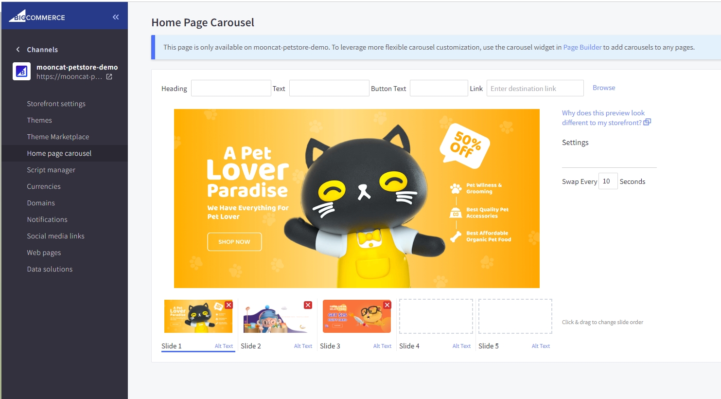
Upload the carousel images in Storefront > Home Page Carousel.
Go back to Page Builder, in Theme Styles > Home Page, make sure Carousel > Show carousel is selected. You can change the carousel styles and colors here.
Watch the instruction video:
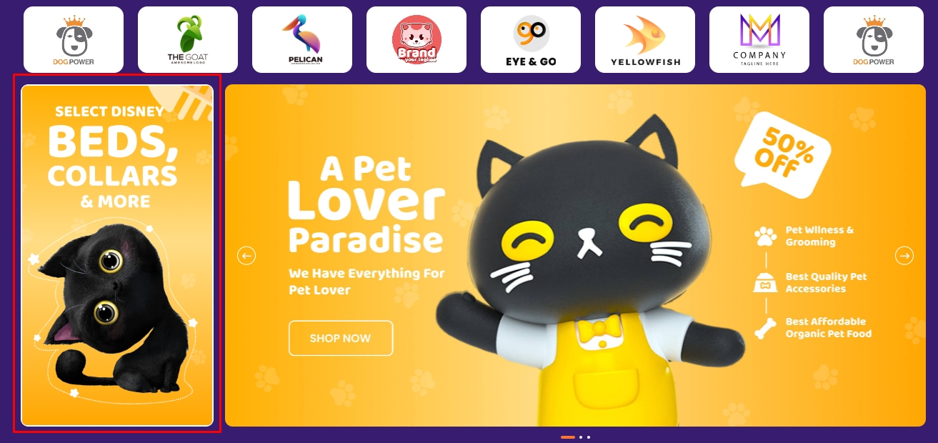
Popular Brand logos
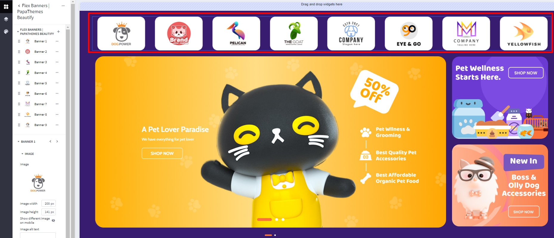
To create popular brands in home page carousel:
click on Theme Styles > Home Page > Carousel find show top column and enable it to open widget region.
Drag and drop layout widget from page builder to corresponding position in top column. Change column to 1. Set margin left and right = 0. Select column 1 and change padding left, right = 0
drag & drop Flex Banners | PapaThemes Beautify widget to layout. Delete all banner except banner 1. In Banner click on Image and upload your image. Change image width = 210px and height = 140px (recommend). Change border radius to 20px. In General section, click on padding change left, right value to 12 for desktop and table and 5 for mobile device.
Duplicate banner 1 to quantity that you want and update your image for each banner.
Click on ... at the right of widget name and select Setting > Carousel > Enable carousel. click on pen icons to open carousel setting change items per slide for desktop = 8, tablet = 4 and mobile = 2.
Watch the instruction video:
Left column banner in homepage carousel
To display left banner in Main carousel.
click on Theme Styles > Home Page > Carousel find show left column and enable it to open widget region.
Drag and drop layout widget from page builder to corresponding position in left column. Change column to 1. Set margin left and right = 0. Select column 1 and change padding left, right = 0.
drag & drop Flex Banners | PapaThemes Chiara widget to layout. Delete all banner except banner 1. In Banner click on Image and upload your image. Change image width = 398px and height = 712px. Change border radius to 10px
To remove border please create custom script as follow.
Go to Storefront > Script Manager, click Create a Script, choose:
- Location on page = Footer
- Select pages where script will be added = All Pages
- Script type = Script
Enter the script below to Scripts contents:
<script>
(function() {
var style = document.createElement('style');
style.innerHTML = '.heroCarousel-left-col{border:none}';
document.head.appendChild(style);
})();
</script>
Right column banner in homepage carousel
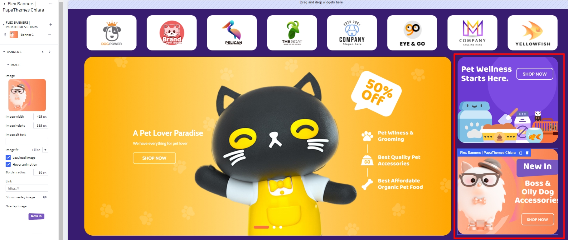
To display right banner in Main carousel.
click on Theme Styles > Home Page > Carousel find show right column and enable it to open widget region.
Drag and drop layout widget from page builder to corresponding position in right column. Change column to 1. Set margin left and right = 0. Select column 1 and change padding left, right = 0.
drag & drop Flex Banners | PapaThemes Chiara widget to layout. Delete all banner except banner 1. In Banner click on Image and upload your image. Change image width = 415px and height = 357px. Change border radius to 30px. In General section, set all padding value t 0 for all device.
Duplicate Flex Banners | PapaThemes Chiara widget. Select second banner change your image and overlay image.
Noted: Total the height of two banner minus 24px should equal height of main carousel banner.
Watch the instruction video:
Top categories
Desktop

Mobile

To create Top categories, in Page Builder drag and drop the Layout widget to the position home below carousel. Select the layout change column to 1 and change layout name = TOP CATEGORIES.
Drag and drop Flex Banners | PapaThemes Beautify to the layout delete all the items except the first one then change to your image change width = 237 and height = 100. If you want to show different image on mobile please enable show different image on mobile change to your image on mobile and set width = 82, height = 120. Open content tab disable heading and enable description change content align = center, Content padding Top = 12px Left = 60px. In general tab change padding Top, right, bottom, left = 8px.
On Flex Banners | PapaThemes Beautify choose setting. In general tab enable display content overlaying banner on mobile. In carousel tab, enable carousel and click on setting. In carousel setting , setup following Items per slide = 6, table and mobile = 4. Enable show dot.
At Description text > setting change Description style = Custom set Font size = 18px, Font site (Mobile) = 14px and Text color = #0F0F2D.
To change the background color, edit the layout, set Layout Background to a certain color that you want.
To setup heading, drag and drop section heading | PapaThemes Beautify and type your heading. Change padding bottom = 20px, alignment = center
Watch the instruction video:
Product by category
Desktop
With Left banner:
With out Left banner:
Go to Theme Styles > Home Page, in the Sections field select Product by category.
To create Left banner:
Drag & drop the Flex Banners | PapaThemes Beautify widget to the corresponding position. Delete all other banners except the first one.
Upload your image in Image field. Set Image Width = 304px and Image Height 466px. You can change Border radius = 30px.
If you want to show different image on mobile please enable show different image on mobile upload your image in Image (Mobile) field. Set Image Width (Mobile) = 388px and Image Height (Mobile) = 295px.
In Content, hide Heading text if your banner already has text.
In General > Padding panel, set 0 for all values and 18 for bottom (Mobile).
Select the Column 1 set padding = 0 0 0 0.
To change Border color of the title:
In Theme Styles > General > Link Colors change color you want.
Watch the instruction video:
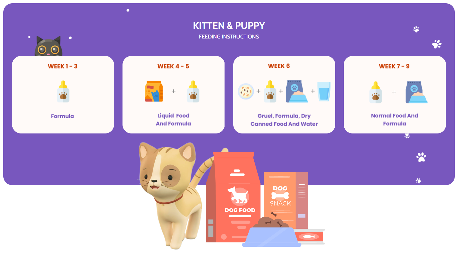
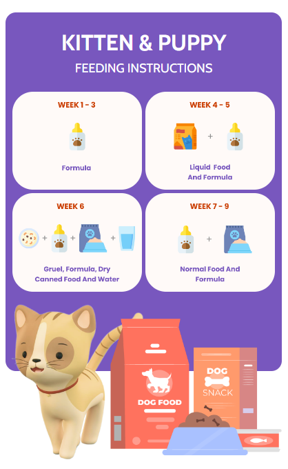
Kitten and Puppy
Desktop
Mobile
To create banner kitten puppy:
In Page Builder drag & drop Layout to the corresponding position and change Columns = 1, Layout name = KITTEN PUPPY.
Select the Column 1, in COLUMN BACKGROUND choose Background = Image and upload image background, that you want.
To create title:
Drag & drop the Text widget into Column 1. Typing your text (example "KITTEN & PUPPY"). Choose Font weight = Semi Bold, Font size = 32px, Text color = #FFFFFF.
Drag & drop the second Text widget into Column 1 below Text (KITTEN & PUPPY). Typing your text (example "FEEDING INSTRUCTIONS"). Choose Font size = 18px, Text color = #FFFFFF.
Drag & drop the Spacer | PapaThemes Beautify into Column 1 about at the top and below Text (FEEDING INSTRUCTIONS). Set value Desktop = 50px, Tablet = 40px, Mobile = 20px.
To create content:
Drag & drop the Flex Banners | PapaThemes Beautify widget into Column 1 at the bottom. Delete all other banners except the first one.
Upload your image, set Image Width = 345px, Image Height 262px, Border radius = 30px. If you want to show different image on mobile please enable show different image on mobile upload your image in Image (Mobile) field.
In Content, hide Heading text if your image already has text.
In General > Width panel choose Width = % and set Value (Desktop) = 25%, Value (Tablet) = 50%, Value (Mobile) = 50%. In Padding panel set value Desktop = 0 14 0 14, Tablet = 0 9 9 0, Mobile = 0 2,5 2,5 0.
Duplicate to 4 banners and upload images according to each banner.
On Flex Banners | PapaThemes Beautify choose Settings. In General disable Display banners in container div, change Your theme name = mooncat, in Padding panel set value Desktop = 0 15 0 15, Tablet = 0 18 0 18, Mobile = 0 10 0 10.
Drag & drop the Spacer | PapaThemes Beautify widget into Column 1 below Flex Banners | PapaThemes Beautify. Set value Desktop = 172px, Tablet = 155px, Mobile = 115px.
To create below banner:
Drag & drop the second Layout below Layout (KITTEN PUPPY) and change Columns = 1, select the Column 1 set Padding = 0 0 0 0.
Drag & drop Flex Banners | PapaThemes Beautify widget into the second Layout. Delete all other banners except the first one.
Upload your image, set Image Width = 639px, Image Height 373px, Border radius = 30px. If you want to show different image on mobile please enable show different image on mobile upload your image in Image (Mobile) field.
In Content, hide Heading text if your image already has text.
In General > Padding panel set value Desktop = 20 0 50 0, Tablet = 20 0 40 0, Mobile = 20 0 20 0.
On Flex Banners | PapaThemes Beautify choose Settings. In Padding panel set 0 for all values and 50 for top (Mobile)
Select the Column 1 inside the Layout (KITTEN PUPPY) set Margin = 0 0 -172 0, Padding = 0 0 0 0.
Watch the instruction video:
Top Brand
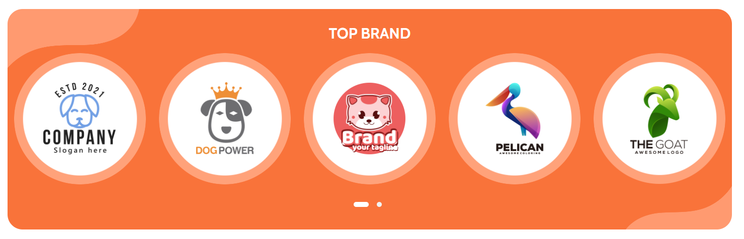
To create Top brand:
Drag & drop Layout widget to the corresponding position, change Columns = 1, Name = ROUNDED, select the Column 1 set Padding = 0 0 0 0. In COLUMN BACKGROUND choose Background = Image and upload your.
Drag & drop Section Heading | PapaThemes Beautify widget into the Layout. Typing your text (example "TOP BRAND"), select custom in Text style field, set Font size = 30px, Text color = #FFFFFF, Padding = 30 0 20 0, Padding (Mobile) = 20 0 10 0.
Drag & drop Flex Banners | PapaThemes Beautify widget below Section Heading | PapaThemes Beautify widget. Delete all other banners except the first one.
Upload your image, set Image width = 266px, Image height = 266px, Border radius = 266px. If you want to show different image on mobile please enable Show different image on mobile upload your image in Image (Mobile) field.
In Content, hide Heading text if your image has text.
In General > Padding panel set value Desktop = 0 13 30 13, Tablet = 0 8 12 8, Mobile = 0 4 10 4.
Duplicate to 10 banners and upload images according to each banner.
In Settings of Flex Banners | PapaThemes Beautify:
In General > Padding panel set value Desktop = 0 0 30 0, Tablet = 0 0 12 0, Mobile = 0 0 10 0.
In Carousel, show Enable carousel, in Carousel settings panel set value Items per slide = 5, Items per slide (Tablet) = 4, Items per slide (Mobile) = 3, unchecked Show arrows.
Watch the instruction video:
Double banner
Desktop

Mobile
To create Double banner:
Drag & drop Layout widget to the corresponding position, change Column = 1, Name = BOXED.
Select the Column 1 set Padding = 0 0 0 0.
Drag & drop Flex Banners | PapaThemes Beautify widget into Column 1.
Select Banner 1, upload your image, set Image width = 1055px, Image height = 436px, enable Show different image on mobile and upload your image in Image (Mobile), set Image width (Mobile) = 388px, Image height (Mobile) = 961px, Border radius = 30px.
In Content, hide Heading text if your image has text.
In General > Width panel choose Width = %, set Value (Desktop) = 70%, Value (Tablet) = 70%, Value (Mobile) = 100%.
In General > Padding panel set value Desktop = 0 10 0 0, Tablet = 0 5 0 0, Mobile = 0 0 0 0.
Select Banner 2 and upload image corresponding, set Image width = 435px, Image height = 435px, Border radius = 30px. If you want to show different image on mobile please enable Show different image on mobile.
In Content, hide Heading text if your image has text.
In General > Width panel choose Width = %, set Value (Desktop) = 30%, Value (Tablet) = 30%, Value (Mobile) = 100%.
In General > Padding panel set value Desktop = 0 0 0 20, Tablet = 0 0 0 10, Mobile = 25 0 0 0.
In Settings of Flex Banners | PapaThemes Beautify > General unchecked Display banners in container div and checked Display content overlaying banner on mobile.
Watch the instruction video:
Banner
Desktop

Mobile

To create Banner:
Drag & drop Layout widget to the corresponding position, change Column = 1, Name = BOXED.
Select Column 1, set Padding = 0 0 0 0.
Drag & drop Flex Banners | PapaThemes Beautify widget into Colum 1. Delete all other banners except the first one.
Upload your image, set Image width = 1720px, Image height = 458, Border radius = 30px. Enable Show different image on mobile, upload your image in Image (Mobile), set Image width (Mobile) = 388px, Image height (Mobile) = 655px, Border radius = 30px.
In Content, hide Heading text if your image has text.
In General > Padding, set 0 for all values.
In Settings of Flex Banners | PapaThemes Beautify > General, unchecked Display banners in container div and checked Display content overlaying banner on mobile.
Watch the instruction video:
Special products tabs
You can configure special products tabs section settings in Page Builder > Theme Styles > Home Page, make sure one of the Sections field has Special Products Tabs selected.
In New / Featured / Bestselling Tabs section, Change Number of products = 5 and Number of products load more on viewport = 0. You can change Default tab to Featured, Bestselling or New. Display type can be changed to Carousel or Grid. Show more button, featured products, bestselling products, new products, categories can be enabled by checked box.
Watch the instruction video:
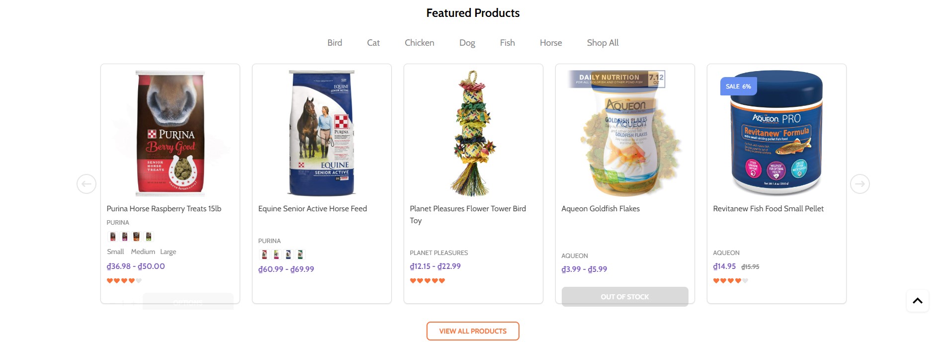
Featured products
You can set featured products in Products, click the star icon on the same row to set the product as featured.
Go back to Page Builder > Theme Styles > Home Page, make sure one of the Sections field has Featured Products selected. In Featured products section, you can change the Heading, Number of products to display, Number of product per row (Columns), changing Display type to Carousel or Grid, changing the background color, editing the link of View all products.
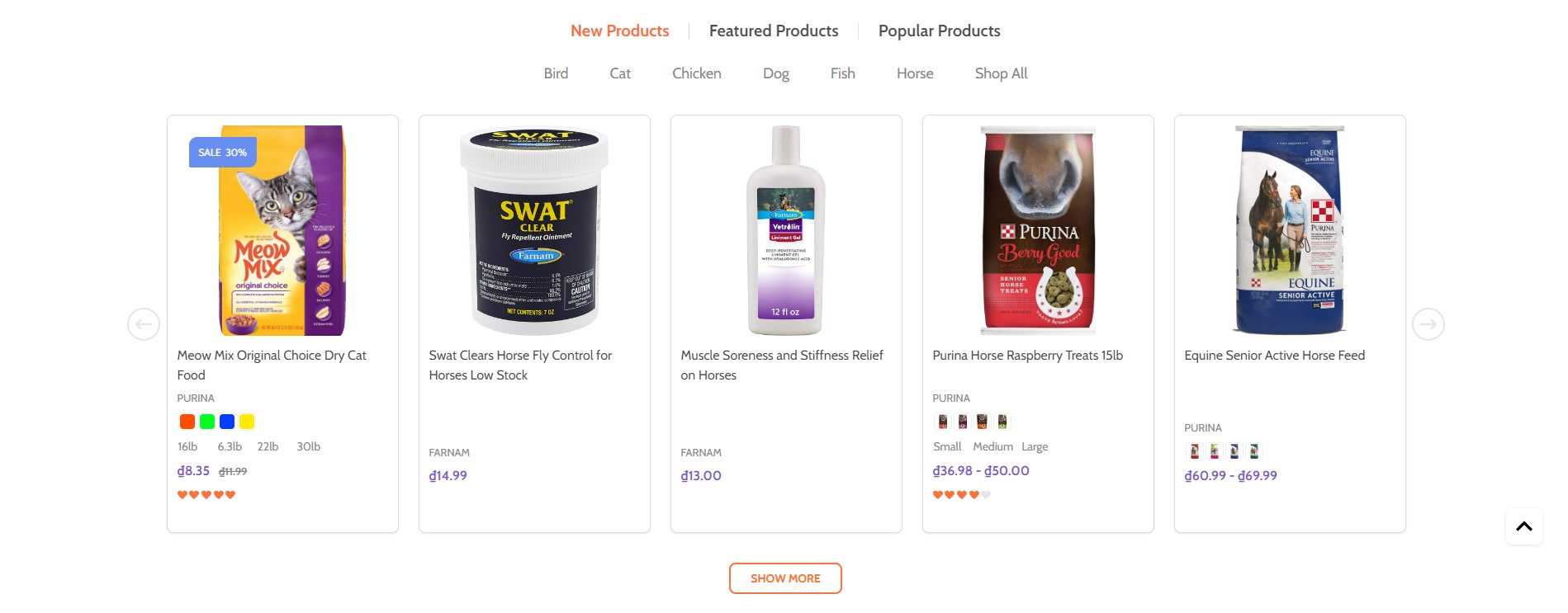
New products
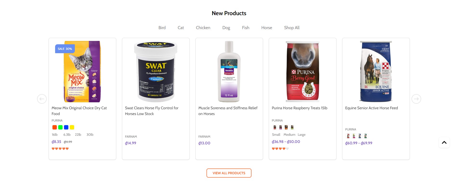
You can configure new products section settings in Page Builder > Theme Styles > Home Page, make sure one of the Sections field has New Products selected. In New products section, you can change the Heading, Number of products to display, Number of product per row (Columns), changing Display type to Carousel or Grid, changing the background color, editing the link of View all products.
Bestselling products
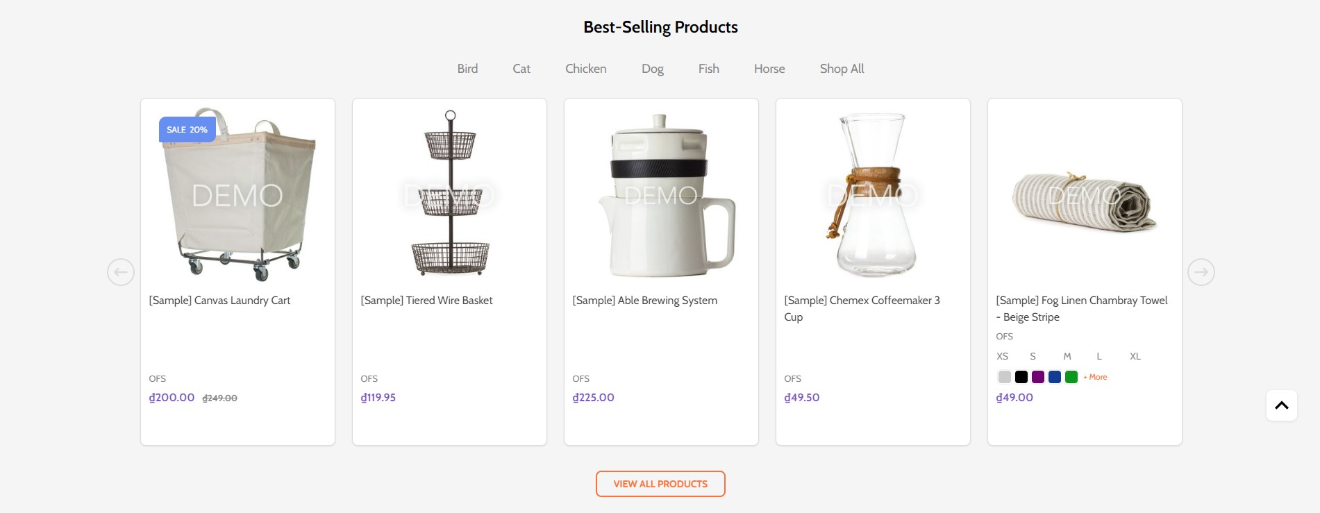
Bestselling products only display when your store has some order.
You can configure bestselling products section settings in Page Builder > Theme Styles > Home Page, make sure one of the Sections field has Popular Products selected. In Best-sellers products section, you can change the Heading, Number of products to display, Number of product per row (Columns), changing Display type to Carousel or Grid, changing the background color, editing the link of View all products.
Recently Viewed Products
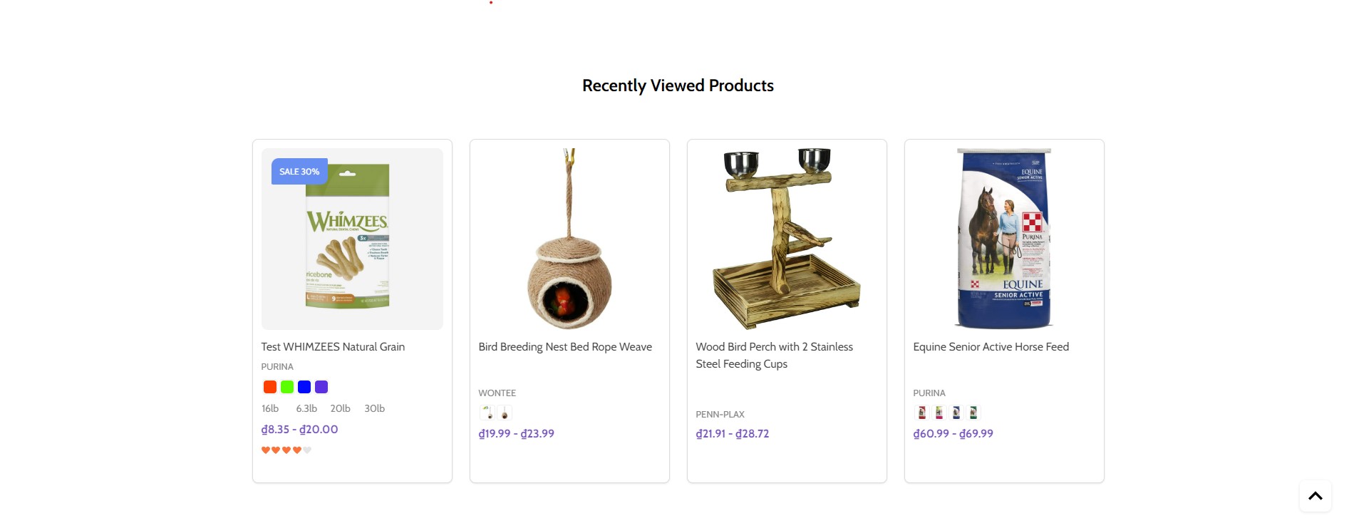
Recently Viewed Products will be display automatically viewed any product.
You can configure recently viewed products section settings in Page Builder > Theme Styles > Home Page, make sure one of the Sections field has Recently Viewed Products selected. In Recently Viewed Products section, you can change the Heading, Number of products to display, Number of product per row (Columns), changing Display type to Carousel or Grid, changing the background color, editing the link of View all products.
Instagram photos

To display your Instagram photos, open https://instagram.papathemes.com/ Follow the instruction on this page to Connect your Facebook Page with your Instagram account. Then click Login With Facebook button and follow the further steps to authorize access permission. Click Show Embedding Code button to generate the code embedding to your web store. Choose Preset = Carousel and select LazyLoad.
Copy all the code appear in Step 1 & Step 2. For example:
<script>!function(){var a=document.createElement("script");a.defer=!0,a.src="https://papathemes.s3.amazonaws.com/instagramapp/assets/js/embed-1.0.1.js",a.onload=function(){PapathemesInstagramApp.init({account_id:"****************",element_id:"papainstagram-render",limit:"20",preset:"grid",lazyload:"false"})},document.body.appendChild(a)}();</script>

<div id="papainstagram-render"></div>
Go back to your store Page Builder. Drag & drop the HTML widget to the corresponding position. Paste the generated code above to the HTML editor, and click Save HTML button. Your Instagram photos should display like our demo store.
Please note that the app only updates your latest uploaded photos every 6 hours.
To create the title, drag & drop the Section Heading widget to above the Instagram photos. Set Padding = 40 0 40 0 and Padding (Mobile) = 20 0 20 0.
Watch the instruction video:
Recent blog posts
You can add blog posts in Storefront > Blog. Click the + button to add a new blog post. Make sure Blog Visibility is on.
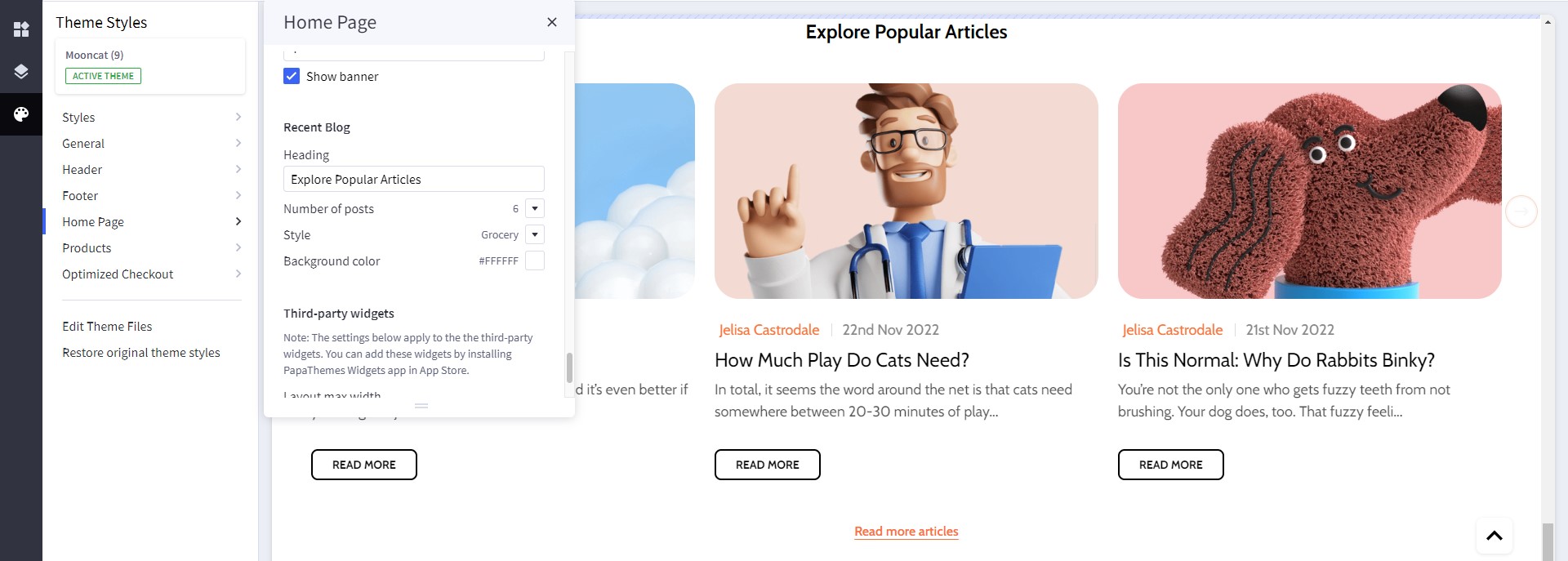
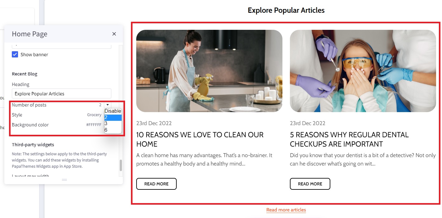
To display the recent blog posts on the home page, go to Page Builder. In Theme Styles > Home Page, make sure one of Sections has Recent Blog selected. Scroll down the Recent Blog section, you can configure Heading, Number of posts to display. Select Style = Grocery to display like our demo store. You can change the Background color = #ffffff or any color you want.
Watch the instruction video:
Newsletter
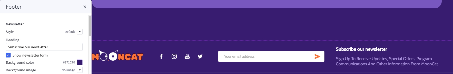
To enable newsletter form, go to Marketing > Email Marketing, make sure Allow Newsletter Subscriptions is checked. Optionally select Show Newsletter Summary and enter the summary text as you want.
Go to Page Builder, in Theme Styles > Footer > Newsletter section, select Style = Default. Select Show store logo and Show social icons = In newsletter.
Make sure Show newsletter form is selected. You can change the Heading, background color, background image, button and text colors.
Watch the instruction video:
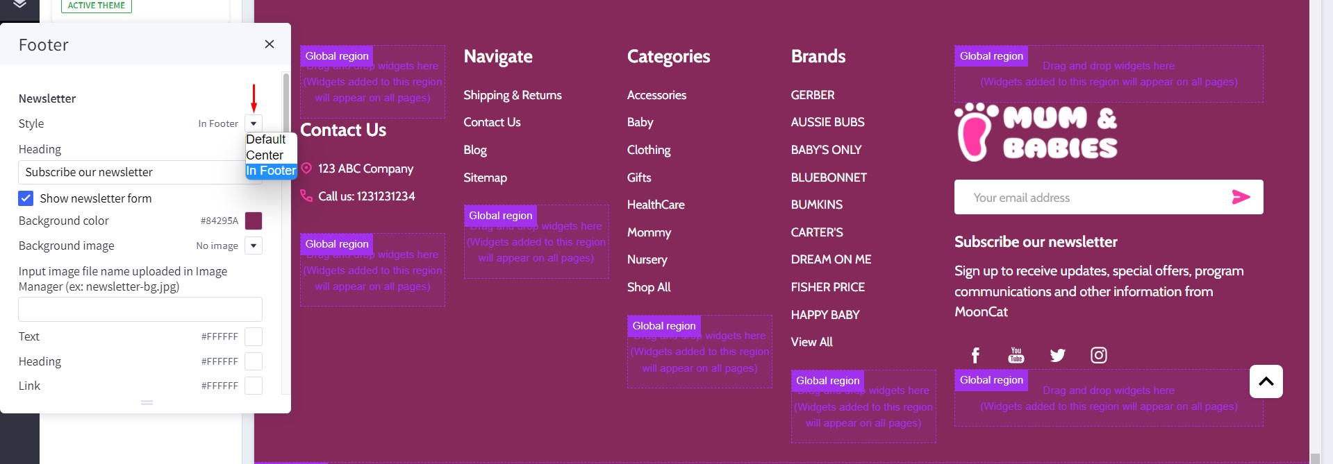
Footer
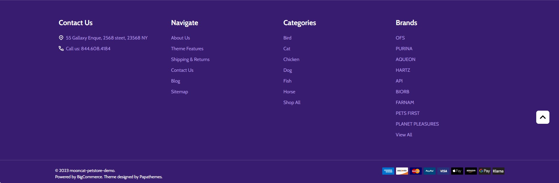
In Page Builder > Theme Styles > Footer, you can configure the newsletter form appearance in Newsletter section, configure the footer link colors in Main Footer section, displaying store logo, contact info, store address,... Show pages allows to limit number of web page links to display. Show categories allows to limit number of category links to display. Similarly for Show brands option.
Payment Icons allows to select which payment icons to display.
Copyright allows to configure the copyright text.
Watch the instruction video:
Display custom footer links
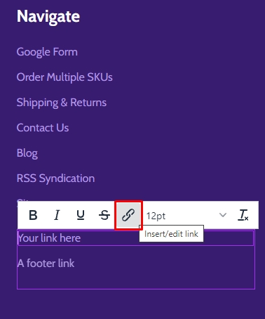
In Page builder > Custom Widget find Footer links | PapaThemes Beautify widget then drag and drop the widget to corresponding position in Footer.
Select the Column 1 and change padding to 0
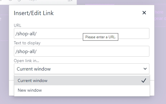
In design you can type your link content and click on the insert/edit link button as picture below:
In the popup window, copy your web link to URL. On the Open links.. field you can select how your link could be open in New Window or Current Window
Setting Up Baby Style Home Page
General
You can read these common instructions in Setting Up Pets Style Home Page chapter:
- Header
- Top Banner
- Ad Banner displays on all pages
- Main carousel
- Top categories
- Product by category
- Kitten and Puppy
- Top Brand
- Double banner
- Banner
- Special products tabs
- Featured products
- New products
- Bestselling products
- Recently Viewed Products
- Instagram photos
- Recent blog posts
- Newsletter
- Footer
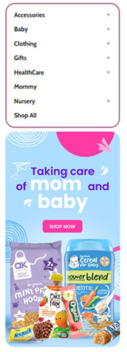
Left-sidebar layout
To display category on left sidebar, in page builder > Theme styles > General. Find option layout, select left-sidebar.

Banner below sidebar
To create Left Banner, drag & drop Layout widget to the corresponding position, change Column = 1.
Select Column 1, set Padding = 0 0 0 0. Drag & drop Flex Banners | PapaThemes Beautify widget into Colum 1. Delete all other banners except the first one.
Upload your image set Image width = 388, Image height = 725 and Border radius = 30px.
In Content, hide Heading text if your image has text already.
In General > Padding, set 0 for all values.
In General > Padding, set 100% for all device.
Footer newsletter
Go to Page Builder, in Theme Styles > Footer > Newsletter section, select Style = In Footer. Select Show store logo and Show social icons = In newsletter.
Make sure Show newsletter form is selected. You can change the Heading, background color, background image, button and text colors.
Setting Up Book Style Home Page
General
You can read these common instructions in Setting Up Pets Style Home Page chapter:
- Header
- Top Banner
- Ad Banner displays on all pages
- Main carousel
- Top categories
- Product by category
- Kitten and Puppy
- Top Brand
- Double banner
- Banner
- Special products tabs
- Featured products
- New products
- Bestselling products
- Recently Viewed Products
- Instagram photos
- Recent blog posts
- Newsletter
- Footer
Setting Up Heath-care Style Home Page
General
You can read these common instructions in Setting Up Pets Style Home Page chapter:
- Header
- Top Banner
- Ad Banner displays on all pages
- Main carousel
- Top categories
- Product by category
- Kitten and Puppy
- Top Brand
- Double banner
- Banner
- Special products tabs
- Featured products
- New products
- Bestselling products
- Recently Viewed Products
- Instagram photos
- Recent blog posts
- Newsletter
- Footer
Three Banners
Desktop

To create Three Banners:
In Page Builder, drag & drop Layout widget to the corresponding position. Change Column = 1. Drag and drop Flex Banners | PapaThemes Beautify widget into Column 1 and duplicate Banner 1 to 3 banners.
To edit Banner 1, change your image, set Image width = 790px, Image height = 435px. Show different image on mobile and upload your image, set Image width (Mobile) = 388px, Image height (Mobile) = 230px, Border radius = 30px.
In Content, hide Heading text if your image already has text.
In General, choose Width = %, set Value (Desktop) = 46%, Value (Tablet) = 100%, Value (Mobile) = 100%. Set Padding for Desktop = 0 10 0 10, Table = 0 15 0 0, Mobile = 21 0 21 0.
To edit Banner 2, change your image, set Image width = 435px, Image height = 435px. If you want to show different image on mobile please enable Show different image on mobile upload your image in Image (Mobile) field. Set Border radius = 30px.
In Content, hide Heading text if your image already has text.
In General, choose Width = %, set Value (Desktop) = 25.5%, Value (Tablet) = 50%, Value (Mobile) = 100%. Set Padding for Desktop = 0 20 0 0, Table = 0 0 32 0, Mobile = 0 0 0 0.
Set values for Banner 3 as the same Banner 2. In General of Banner 3, set Padding for Desktop = 0 0 0 20, Tablet = 0 0 0 15, Mobile = 0 0 0 0.
Recent blog
In Page Builder > Theme Styles > Home Page > Recent Blog find Number of posts, select 2 to change display Recent blog.
Customizing Products Display
Product Card
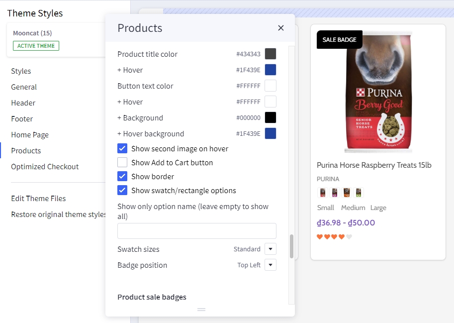
Configuring product cards in Page Builder > Theme Styles > Products > Product cards.
- Alignment: Specifying content alignment
leftorcenter. - Product title color: Specifying the product name's color.
-
- Hover: Specifying color when hover or focus.
- Button text color: Specifying the button text color.
-
- Background: Specifying the button background color.
-
- Border: Specifying the button border color.
- Show second image on hover: Displaying the second image when hover the product card.
- Show border: toggle displaying the product card border.
- Show swatch/rectangle options: Allows to display with swatch/rectangle type product option on every product card. It's helpful to display different product variants like colors or sizes.
- Swatch sizes: Specifying the swatch color/image size.
- Badge position: also to configure the sale badge position to
Top LeftorBelow image.
Displaying product price ranges
By default product price ranges is enabled. To turn off, Go to Page Builder > Theme Styles > Products > uncheck Price ranges checkbox.
Show retail price: Toggle displaying the product retail prices.
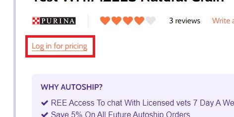
Hiding prices for non logged in customers
To turn on this feature, go to Page Builder > Theme Styles > Products > tick Restrict Purchase to Login checkbox.
Redirecting to cart page after product added to cart
By default the cart popup is displayed, if you want to take customer to the cart page instead, go to Page Builder > Theme Styles > Products > tick Redirect to cart page after add to cart checkbox.
Showing/Hiding Quick-View button
By default quick-view buttons appear on all product cards. To hide it, go to Page Builder > Theme Styles > Products > un-tick Show Quickview checkbox.
Showing/Hiding the quantity box on PDP
By default the quantity box shows up, to hide it, go to Page Builder > Theme Styles > Products > un-tick Show quantity selection on product pages checkbox.
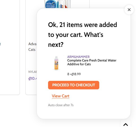
Customizing the popup displayed after product added to cart
In Page Builder > Theme Styles > Products > Popup after added to cart:
Default: Displaying the large popup.Mini: Displaying a smaller popup that has auto close.Cart Preview: Displaying the whole shopping cart popup on the right side.Hide: Not show any popup.
Mini added to cart popup:
Displaying Recently Viewed Products
Recently viewed products only display for logged-in customers.
To enable it, go to Page Builder > Theme Styles > Products > Show recently viewed select number of products to display.
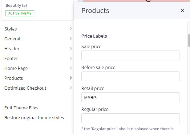
Customizing Price Labels
You can customize sale price label, before sale price label, retail price label or regular price label in Page Builder > Theme Styles > Products > Price Labels
Displaying product weight, dimensions on PDP
Go to Page Builder > Theme Styles > Products > Product Page.
- Tick Show product weight checkbox.
- Tick Show product dimensions checkbox.
Display sale badge / in-stock badge on PDP
Go to Page Builder > Theme Styles > Products > Product Page.
- Tick Show sale badge checkbox.
- Tick Show in-stock badge checkbox.
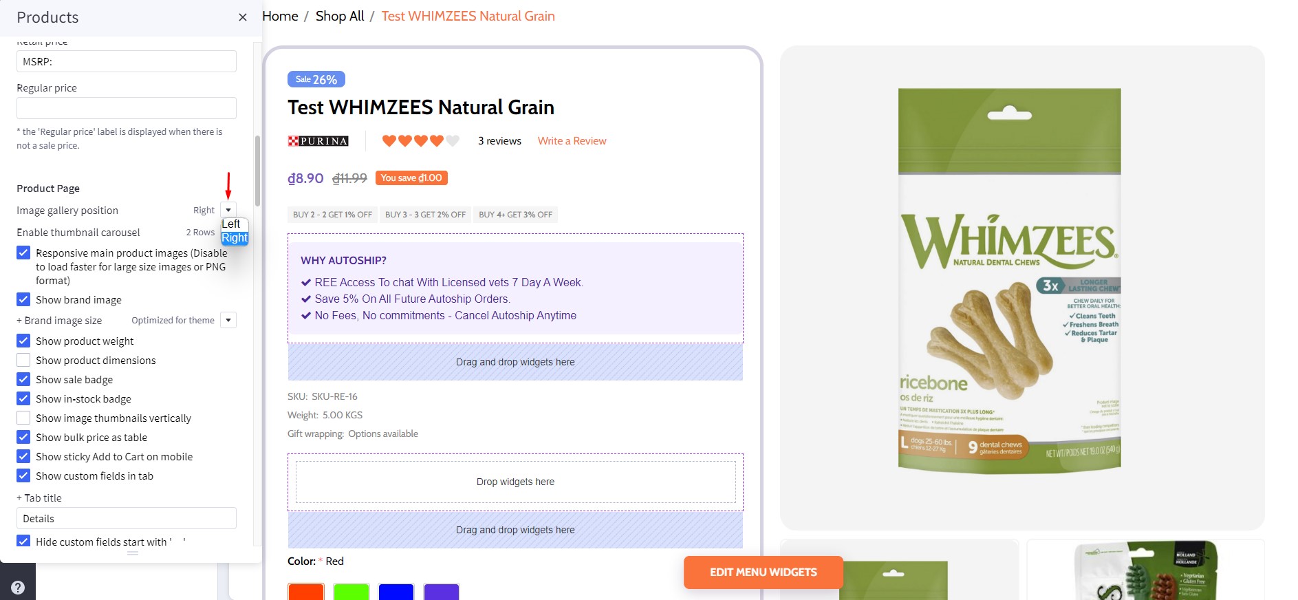
Displaying Image gallery
Image Gallery Position
In Page Builder > Theme Styles > Products > Product Page, In Image gallery position , select Left or Right to change Image gallery position .
Right
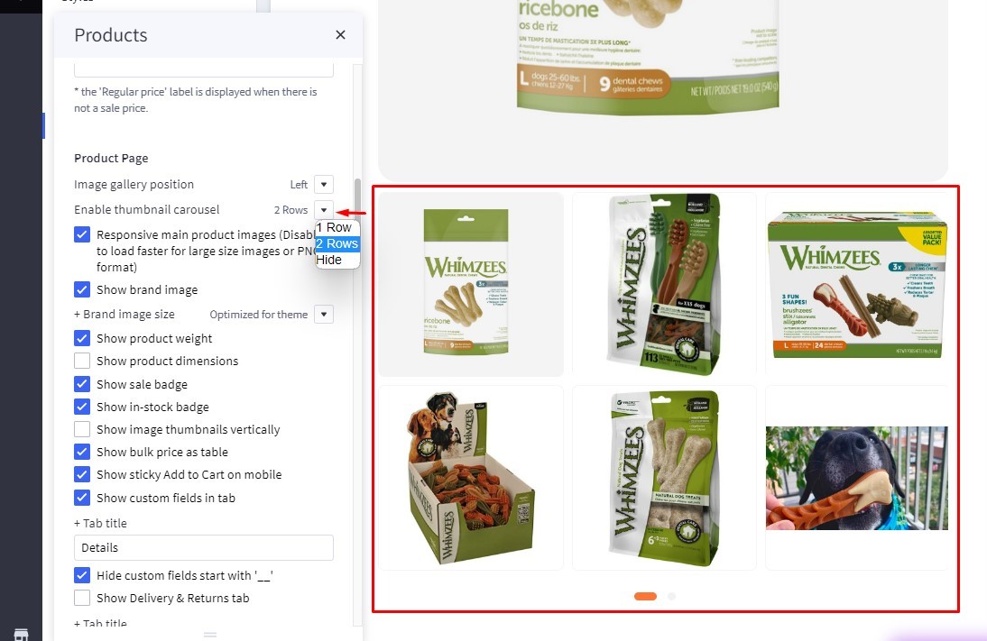
Displaying sub-image as a slider
In Page Builder > Theme Styles > Products > Product Page, Enable thumbnail carousel section, you can change display thumbnail images to slider or grid.
-
1 row: Sub-images are displayed in the slider on 1 row. -
2 rows: Sub-images are displayed in the slider on 2 row. -
Hide: All sub-images are displayed as grid.
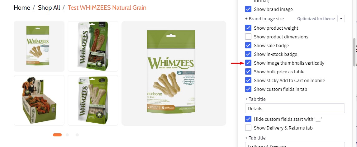
Displaying product image thumbnails vertically
In Page Builder > Theme Styles > Products > Product Page, checked Show image thumbnails vertically to display product thumbnails vertically, otherwise it's displayed horizontally.
Checked Show image thumbnails vertically:
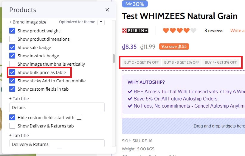
Displaying product bulk pricing inline in table
Instead of displaying bulk pricing in a popup modal, you can display it inline by going to Page Builder > Theme Styles > Products > Product Page, tick Show bulk price as table.
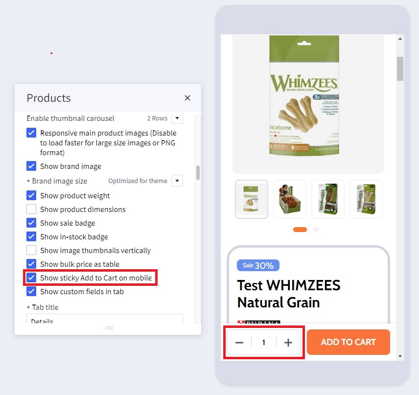
Displaying sticky Add to Cart button on PDP on mobile
In Page Builder > Theme Styles > Products > Product Page, tick Show sticky Add to Cart on mobile.
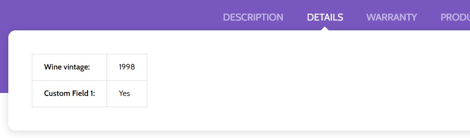
Displaying product custom fields in a separated tab
In Page Builder > Theme Styles > Products > Product Page:
- Tick Show custom fields in tab checkbox.
- Enter the tab title in the next Tab title box.
Custom tabs
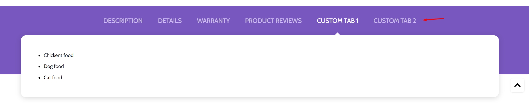 To add the custom tabs and product pages, edit your product description, click on HTML button to open HTML Source Editor:
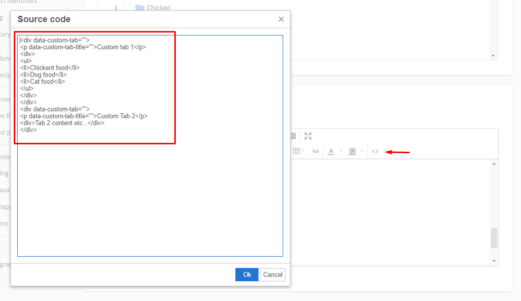
Use the editor in the link to generate HTML for your custom tabs. Click Export HTML button, copy & paste the generated HTML at the end of HTML Source Editor.
Displaying Delivery & Returns tab
In Page Builder > Theme Styles > Products > Product Page:
- Tick Show Delivery & Returns tab checkbox.
- Enter the tab title in the next Tab title box.
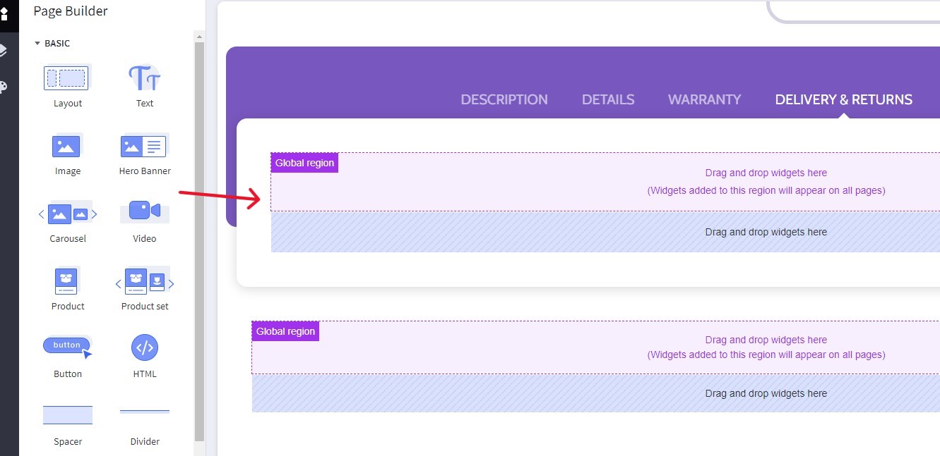
You can add specific content or global content using BC widgets:
Numbers of products, reviews, thumbnails
In Page Builder > Theme Styles > Products > Product Page:
- Number of Product Reviews: Specifying number of product reviews displayed.
- Number of Related Products: Specifying number of related products displayed.
- Number of Customers Also Viewed Products: Specifying number of customer also viewed products displayed.
- Number of visible thumbnails: Specifying number of images displayed in the product thumbnails slider.
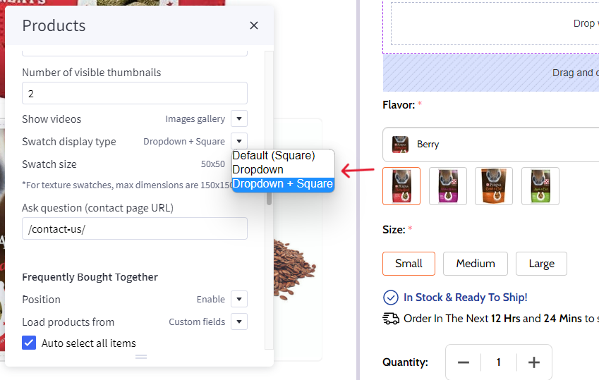
Displaying Swatch Options in the dropdown select box
In Page Builder > Theme Styles > Products > Swatch display type:
- Default (Square): Displaying the regular swatches by default.
- Dropdown: Displaying swatches in the dropdown select box.
- Dropdown + Square: Displaying swatches in the dropdown select box in addition to regular swatches.
Displaying Frequently Bought Together Products
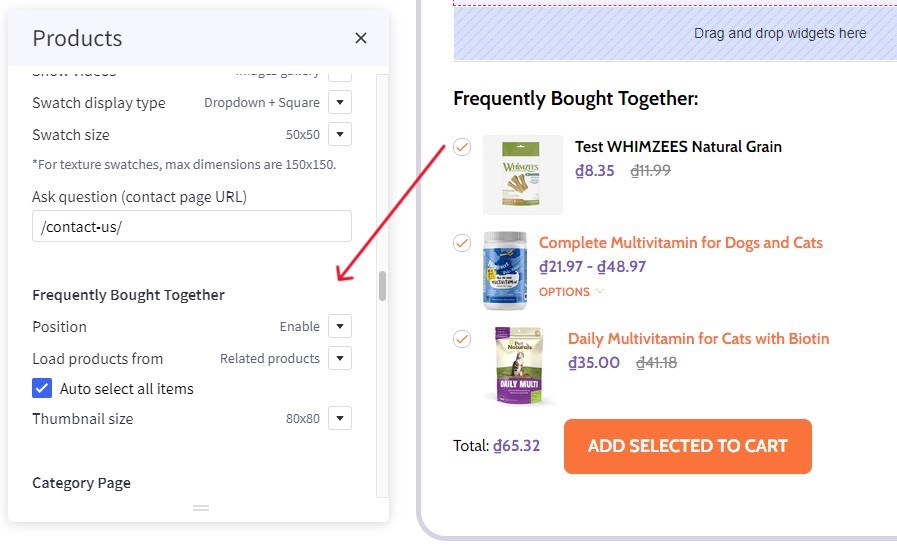
Enabling this feature in Page Builder > Theme Styles > Products > Frequently Bought Together, Select Position to display it.
- Load products from: Specifing products to display here.
Custom fields __alsobought: Specifying the relevant products in product custom fields with name__alsoboughtand value is the relevant product ID. For example: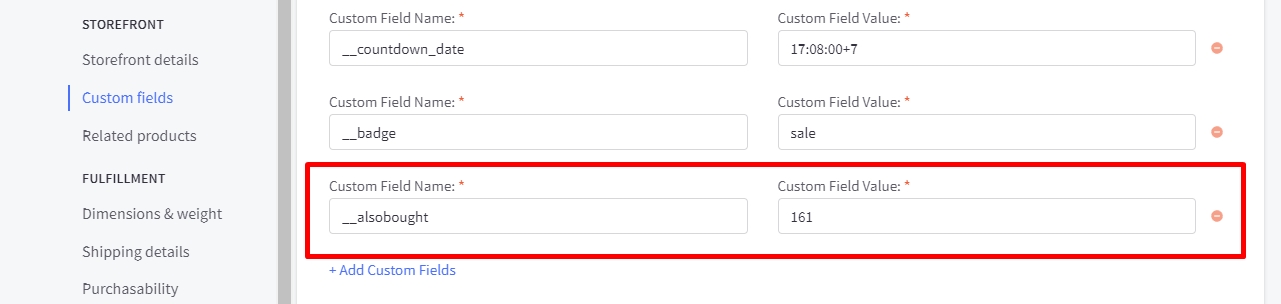
Related products: Pulling from the related products.Similar by biews: Pulling from customer also viewed products.- Auto select all items: Auto select or unselect all frequently bought together products.
- Thumbnail size: Specifying the thumbnail image size.
Configuring swatch dimension
In Page Builder > Theme Styles > Products > Swatch display type > Set Swatch size.
Sale badge, Condition badge and custom text badges
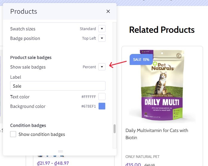
Displaying the sale badge in Page Builder > Theme Styles > Products > Product sale badges, tick Show sale badges.
- Label: Specifying the badge text.
- Text color: Specifying the badge text color.
- Background color: Specifying the badge background color
Displaying the condition badge in Condition badges, tick Show condition badges.
Displaying the condition badge in Custom badges, tick Enable custom badge from '__badge' custom field. Edit product, add custom field with name __badge and value is the badge text.
- Text color: Specifying the text color of the custom badge.
- Background color: Specifying the background color of the custom badge.
Configuring image sizes
In Page Builder > Theme Styles > Products > Image Sizes:
- Main product images: Specifying the main product image size displayed on PDP.
- Thumbnail image: Specifying the product thumbnail size.
- Zoomed image: Specifying the zoomed image size.
- Image in gallery view: Specifying product card image size.
Shipping countdown
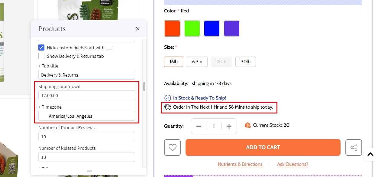
To enable shipping countdown, Theme styles > Product page find shipping countdown field and input your cut off time. Find and copied your timezone from wikipedia https://en.wikipedia.org/wiki/List_of_tz_database_time_zones to timezone field.
Note: The time before cut off the message will show shipping today after cut off the message will show shipping tomorrow
Flash sales
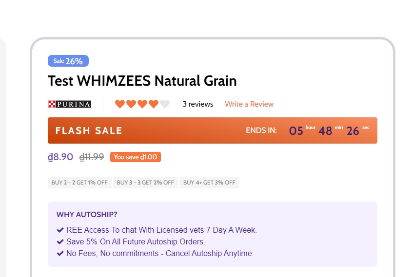
To create flash sales bar for each product, in product select the product that you want to add flash sale bar.
Find customer fields, click on add Add Custom Field. Copy __countdown_label and paste into Custom Field Name. In Custom Field Value, type your content following format: <your banner name>|<end in> (example: FLASH SALES|ENDS IN).
Create another custom field, Copy __countdown_date and paste into Custom Field Name. In Custom Field Value, enter your cut off time following the format: <yyyy>-<mm>-<dd> <hh>:<mm>:<ss><timezone> (example: 2023-03-15 17:00:00-7).
Note:
-
<yyyy>-<mm>-<dd>is optional. If the date is not entered, the banner will repeat automatically right after pass cut off time. -
<hh>:<mm>:<ss>is 24 hour format. -
<timezone>only input+ or -andnumberexample:+7. if timezone are not entered, the countdown time will be different in different countries.
Autoship

Drag and drop Layout widget to the corresponding position, change Column = 1. Select Column 1, set Padding = 15 18 15 18.
Drag and drop Text widget to column 1 change Font size to 16px, set Alignment to Left
Drag and drop HTML widget below Text widget, copy and paste the script below to HTML widget then click on save:
<p style="

  color: #4E299E;
  font-family: arial;
  margin: 0;
  padding: 0;
  text-align: left;
">
<i class='fa fa-check'> </i> REE Access To chat With Licensed vets 7 Day A Week.
<br>
  <i class='fa fa-check'></i> Save 5% On All Future Autoship Orders.
<br><i class='fa fa-check'></i> No Fees, No commitments - Cancel Autoship Anytime
</p>
Brand logo in product detail
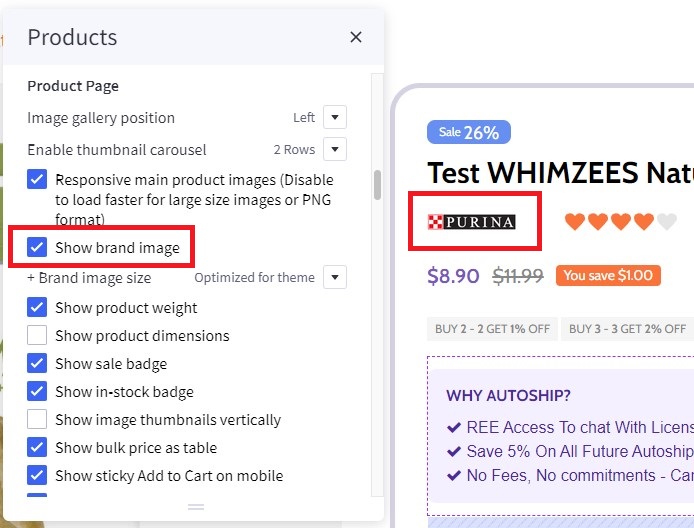
To display Brand logo in product detail, in Page Builder > Products > Product Page find and check Show brand image option.
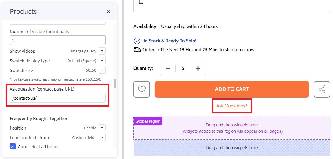
Ask question
In Page Builder > Theme Styles > Products > Product Page find Ask question (contact page URL) and enter /contact-us/ to display Ask Questions?.
Nutrients & Directions
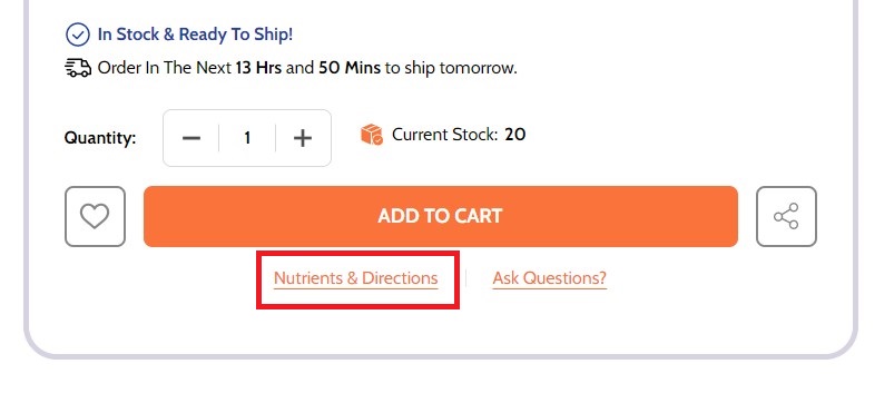
To create additional information link:
In Storefront > Web Pages, click on the Create a Web Page button to create new webpage.
In Web Page Details, enter your page name in Page Name field, Page URL will be automatically generated. In Page content field enter your content.
Uncheck Navigation Menu options.
In Advanced Options set Sort Order = 2.
To display the additional information link in the product detail page:
In Products, select the product you want to display the link. Find Custom Fields, created new custom field. Set Custom Fields Name = __guide_popup and Custom Fields Value = <your page name>|<Page URL> (example: Nutrients & Directions|/nutrients-directions/) then save.
Watch the instruction video:
(wait a resource)
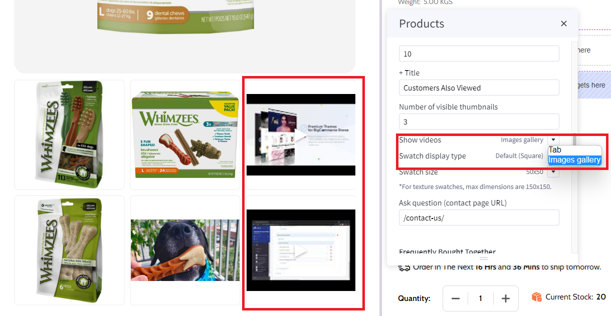
Video image product detail page
In Page Builder > Theme Styles > Products > Product Page find Show videos select tab or image gallery to change display video position.
Videos displayed in tab options:
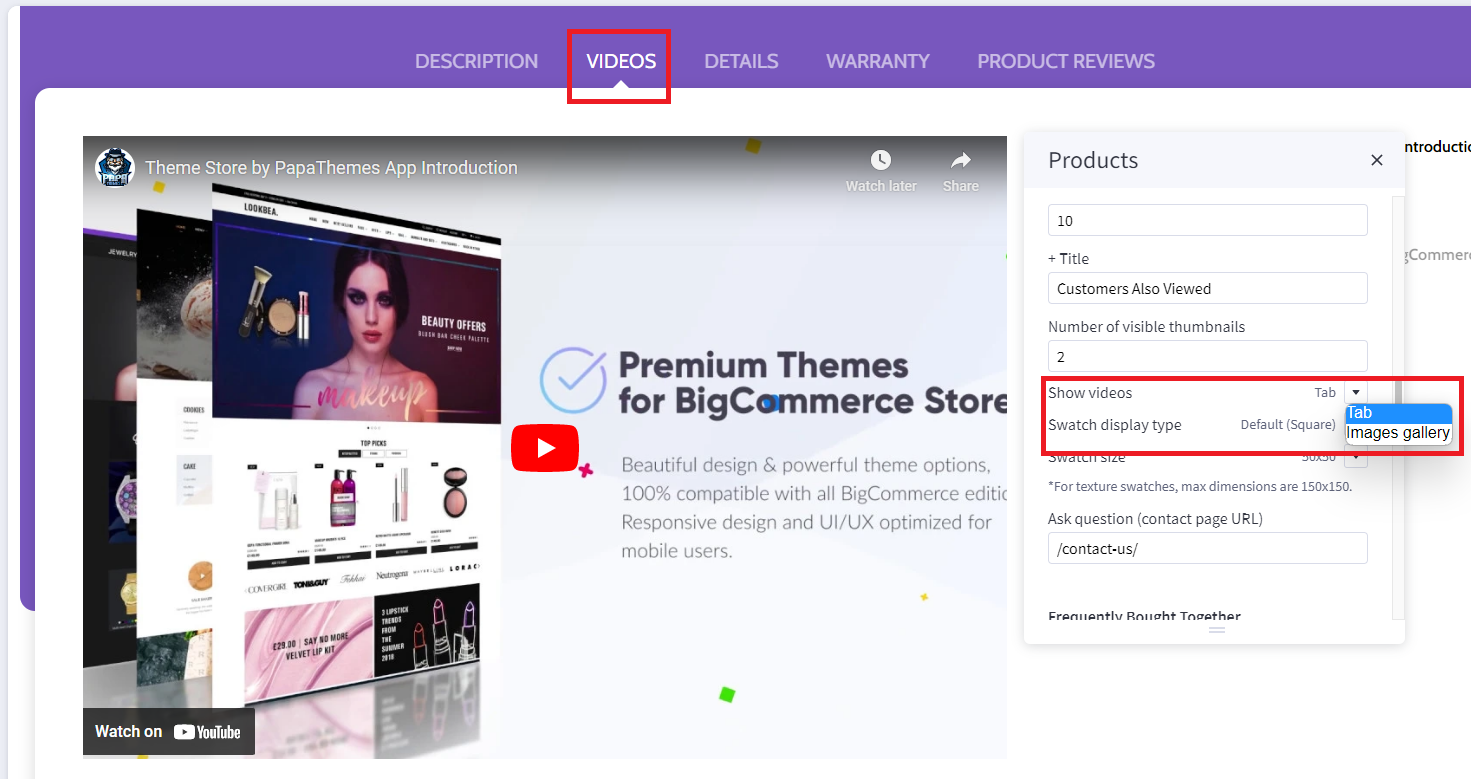
Videos displayed in image gallery option:
Customizing Category Pages
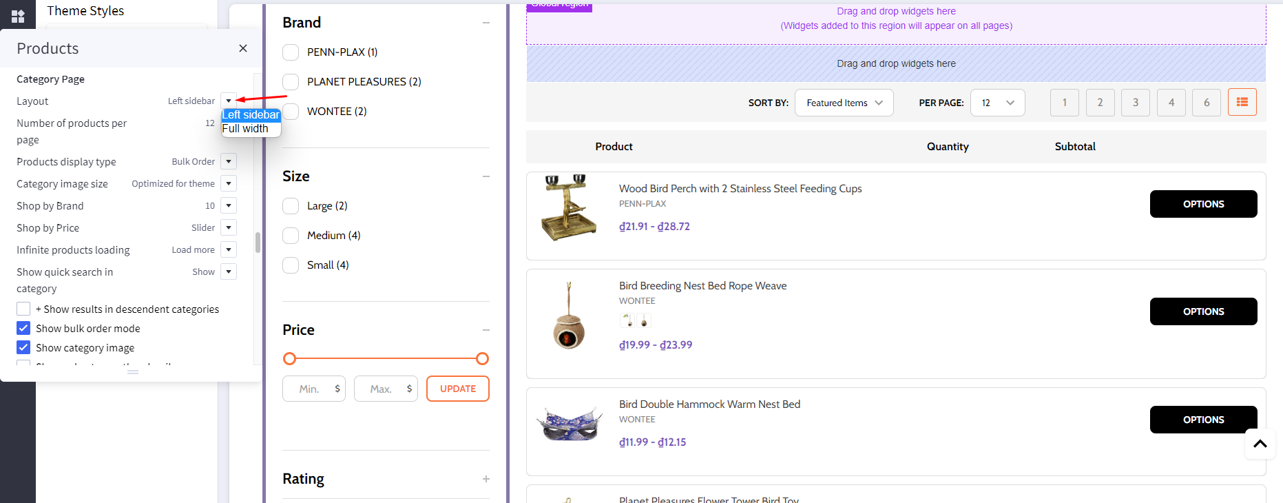
Configuring the category pages in Page Builder > Theme Styles > Products > Category Page.
Category Layout Type
Theme supports displaying category Page layout in Full width mode or Left sidebar mode. In Layout, select the particular display mode for default display.
- Layout =
Full width
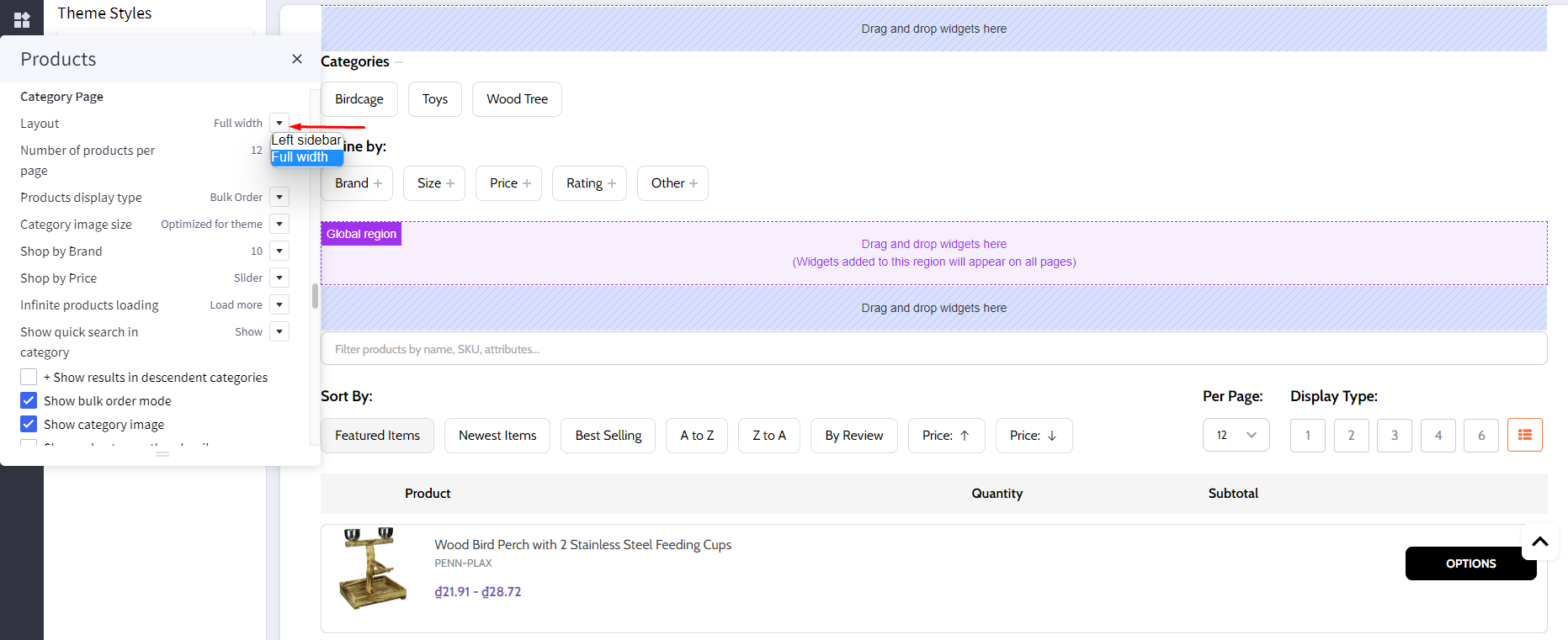
- Layout =
Left sidebar
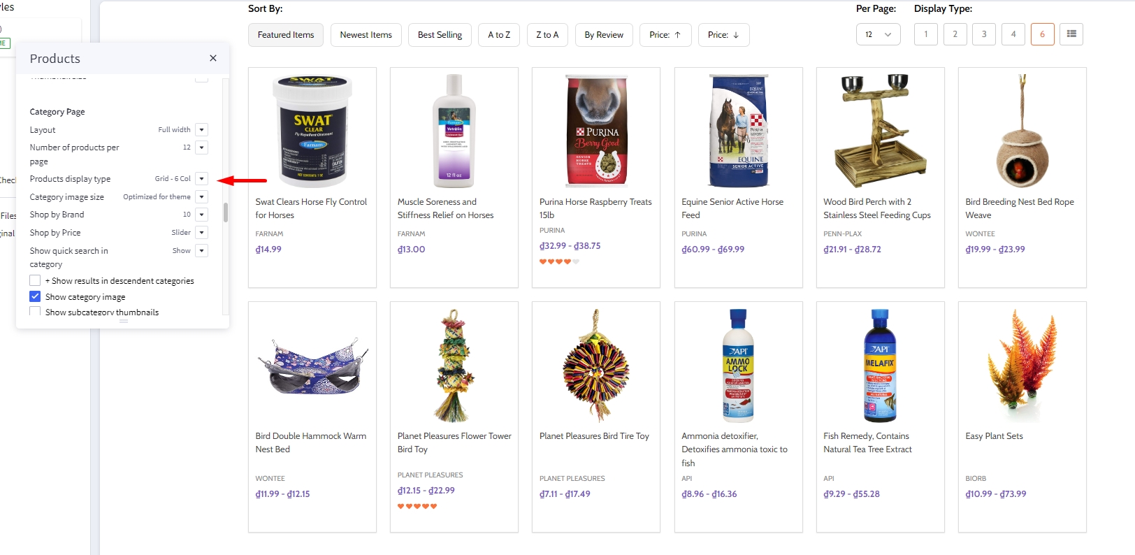
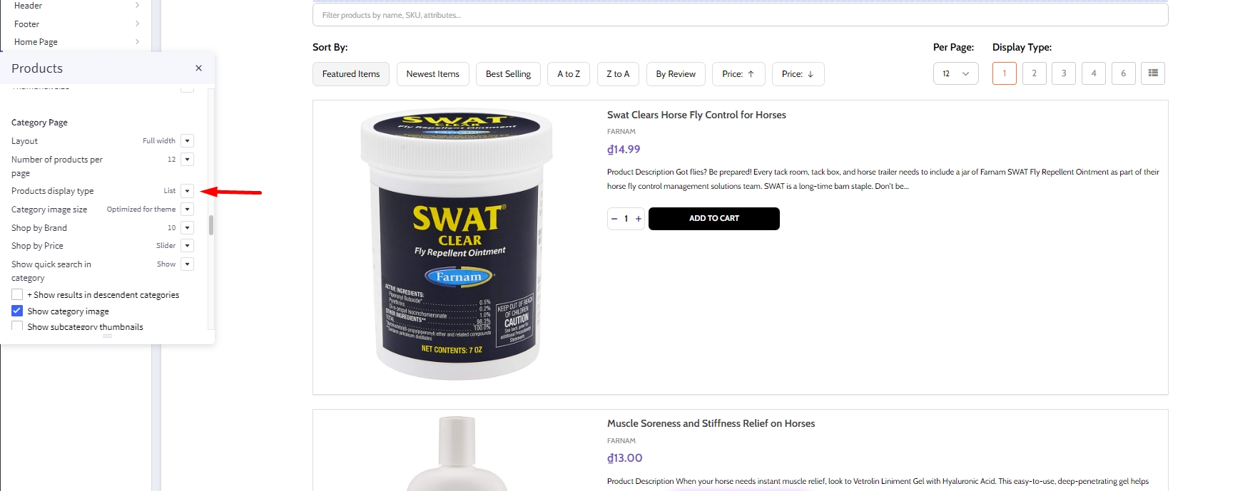
Products Display Type
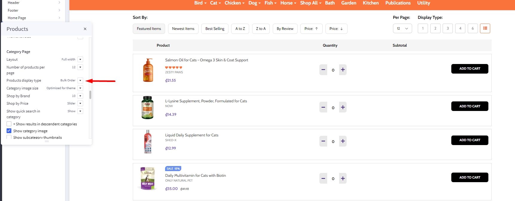
Theme supports displaying products in grid mode (2, 3, 4 or 6 products per row), in list mode or bulk order mode. In Products display type, select the particular display mode for default display.
- Display type on the right allow your customers to change product category display by themselves.

Grid 6 columns:
List mode:
Display Bulk Order layout
To display this bulk order layout, select Products display type = Bulk order.
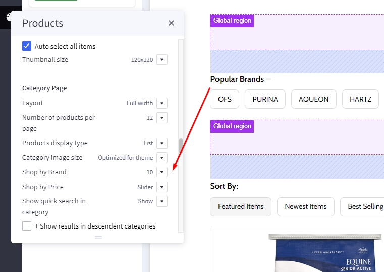
Displaying Shop by Brand
- Shop by Brand: Specifying number of popular brands to display.
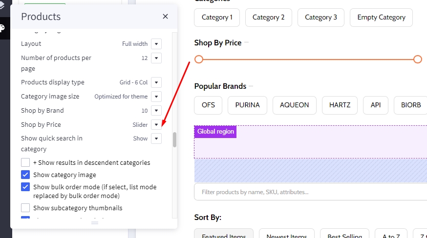
Displaying Price Slider
- Shop by Price:
Slider: Displaying the price slider.List: Displaying price list.Hide.
Infinite Products Loading
This feature allows you to choose the method of loading more products in the current catalog.
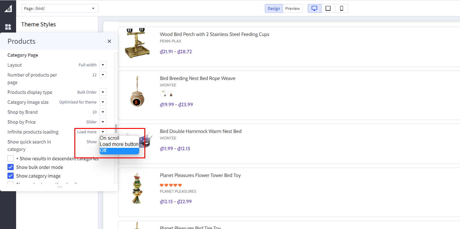
Infinite Products Loading:
-
On scroll: Products will automatic loadout when scrolling down. -
Load more button: Click on the Load more button to continue loading more products. -
Off: Show page numbers and arrow button as original. Click on button to see more products.
Display contextual search
This feature allows searching products within the current category and the current selected filter.
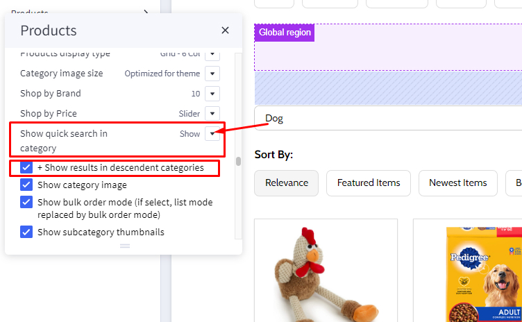
Select Show quick search in category = Show to enable it.
- + Show results in descendent categories: if selected, it also displays results in the descendent categories.
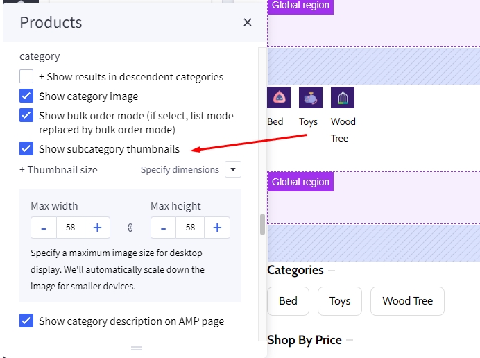
Display subcategory image thumbnails
This feature allow displaying subcategory thumbnails before products.
Select Show subcategory thumbnails to enable it.
Common Settings
- Number of products per page: Specifying number of products to display per page.
- Show category image: Displaying the category image or not.
- Show category description on AMP page: Displaying category description on AMP category page or not. If the category content contains images, the AMP page could be invalid. It's recommended to turn off this option.
Customizing Brand Page & Search Page
Configuring the brand page in Page Builder > Theme Styles > Products > Brand Page.
- Number of brands per page: Specifying number of brands to display per page.
- Number of products per page: Specifying number of products to display per page.
- Brand image in gallery view: Specifying the brand card image size.
- Brand image in brand page: Specifying the large image size displayed on the brand page.
Configuring the search results page in Page Builder > Theme Styles > Products > Search results.
- Number of products per page: Specifying number of products to display on the search results page.
Displaying brand quick-view introduction
In Marketing > Marketing Banner, click Create a Banner button.
- Enter the brand introduction content to Banner Content.
- Select Show on Page =
For a Specific Brandand select the corresponding brand. - Select Location =
Bottom of Page. - Then click Save button to finish.
Watch the instruction video:
Customizing Cart page
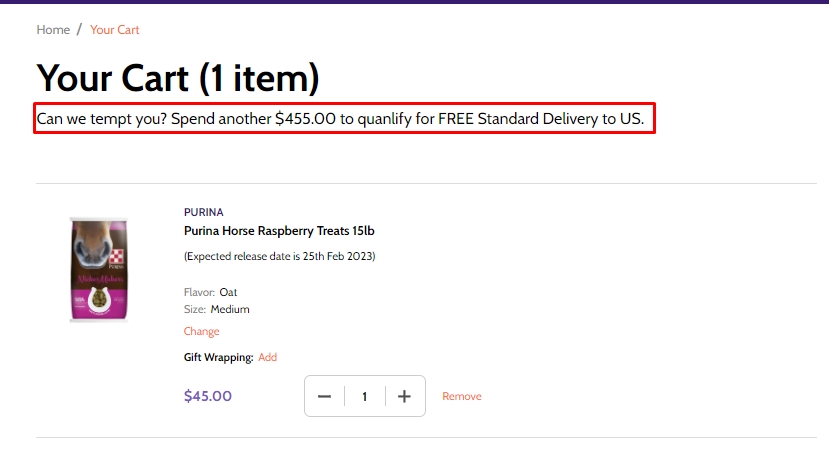
Display free shipping message in cart page.
Not qualify message
Qualify message
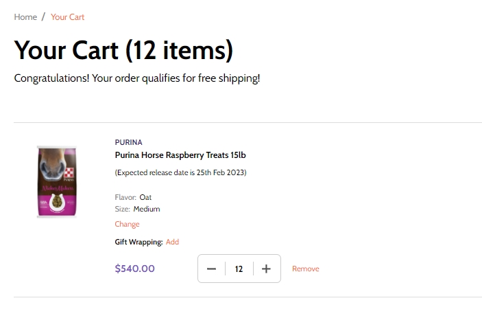
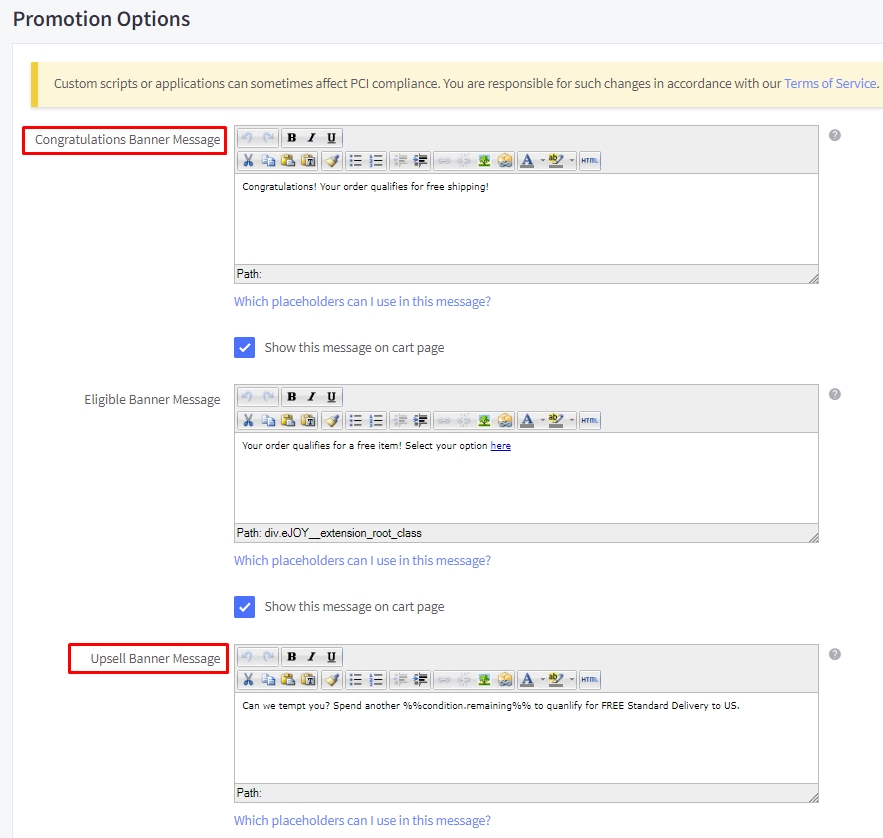
In Marketing > Promotion click on create and select With legacy editor
In Promotion detail name your promotion
In promotion type select Orders totaling more than X amount get free shipping to specific shipping zones at the field spend at least type your amount
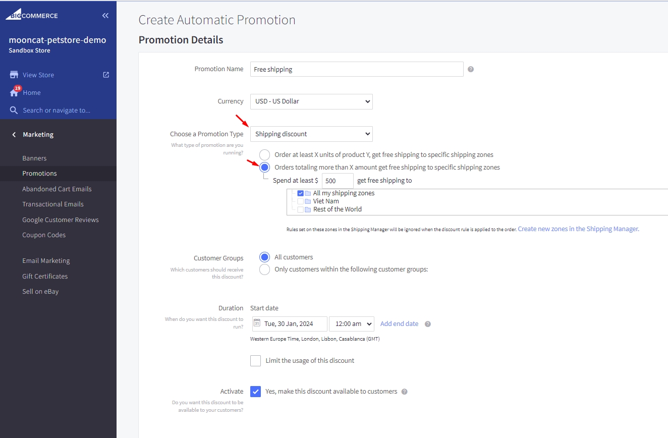
In Promotion option type your message at Congratulations Banner Message to display for cart have qualified and type your message for cart have not qualify at Upsell Banner Message with format [your text] %%condition.remaining%% [your text] then click save